


Whether it’s the first or the hundredth ink you are buying, the doubts you face are always the same: How does the ink compare with others? How fast does it dry? How water-resistant is it? These and other questions preoccupy us before we decide to buy an ink.
Unfortunately, the ink’s name or provided samples are often misleading. For example, the colour “Topaz” from the Pelikan Edelstein series is a vibrant rich azure blue, while the exact same name in Lamy’s Chrystal series denotes a reddish-brown chocolatey colour.
That is why we have come up with our Ink Cards, a concept that provides revealing information about inks, especially when buying online. We hope this will minimise the ambiguities around ink colours.
All Inky Cards are made with a steel M-nib on 80 g/m2 Rhodia paper.

Explanation of the Ink Cards
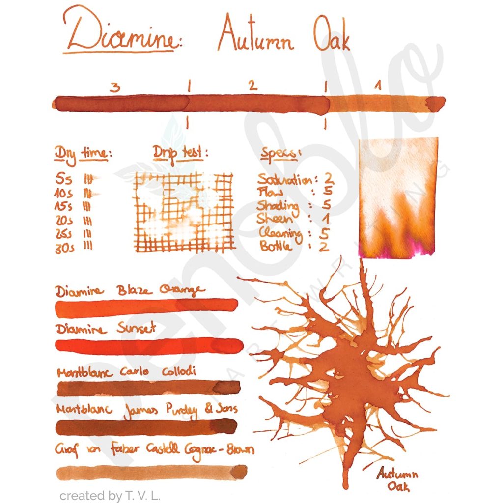
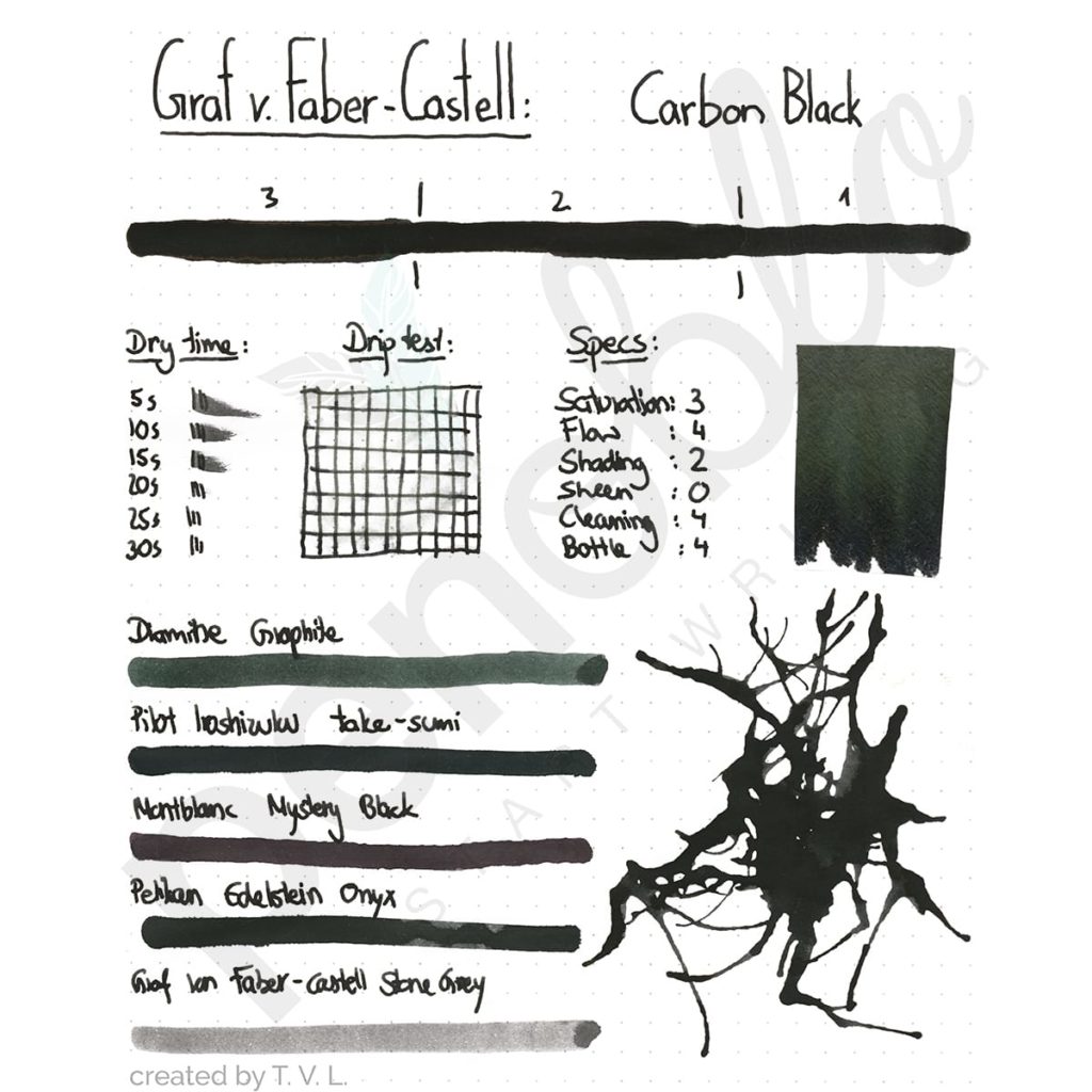
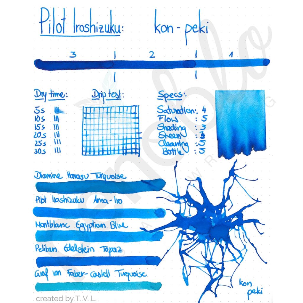
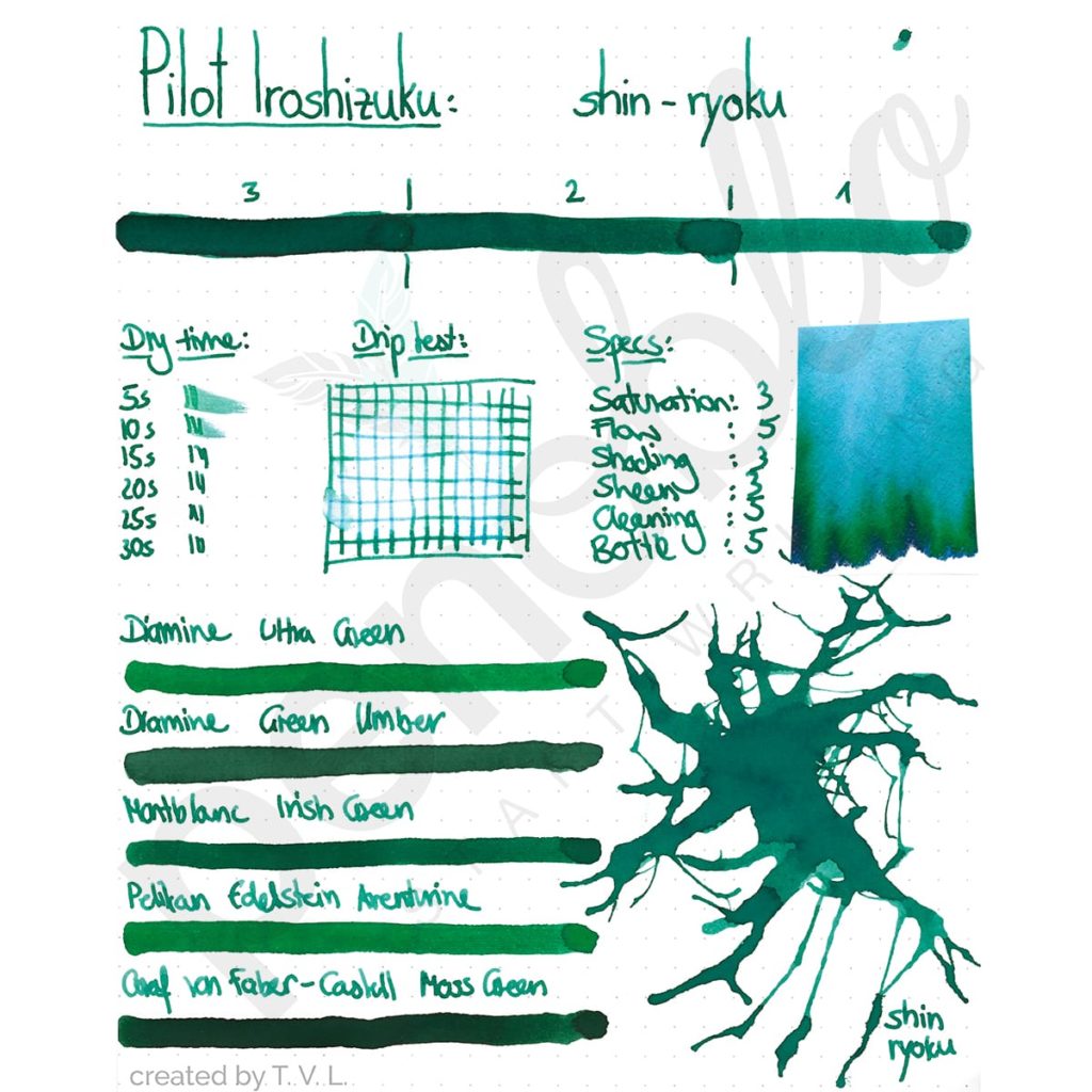
In the top row, you will find the ink’s brand to the left and the ink’s name to the right. On the far right of some Ink Cards you will find a special designation in the form of a letter or number. These stand for inks that come from special series or are available in limited quantities.

Second Row – Ink saturation

In the second row, the ink is spread from right to left in three stages, displaying the ink’s saturation and complexity. This shows how strong the shading and sheen of the ink are.
Shading refers to how uniformly ink spreads on the written area. Strong shading is characterised by strong tonal contrast between strokes. Notice the way the lower half of the letters, or the part of the letter that is written last, looks darker than the rest.
Sheen, on the other hand, refers to the phenomenon that can be observed with some inks after they are dried. When they are held up to the light, they give off a shimmering tone with a completely different colour. Very strong cobalt and admiral blues often give off a scarlet red shimmer. Dark violet and purple tones often shimmer golden-yellow. However, sheen must be distinguished from inks with shimmer particles, such as Diamine Shimmertastic or the J. Herbin 1670 collection. These inks have additional particles mixed in during production that shimmer in the desired colour like glitter. Sheen, on the other hand, comes exclusively from the chemical composition of the ink colour, which makes it all the more individual and fascinating
The above-mentioned qualities of shading and sheen are evaluated according to the following criteria: an ink with strong shading shows a multitude of colour nuances on good paper, but may appear uneven. Weaker shading appears calmer, but may be perceived to be monotonous.
A high level of sheen in an ink is often linked to high saturation, as inks with high saturation tend to have different colour tones after drying. Examples of this are Diamine Majestic Blue and Diamine Bilberry.
Third Row – qualitative details
In the third row, on the far left, a dry time test is conducted
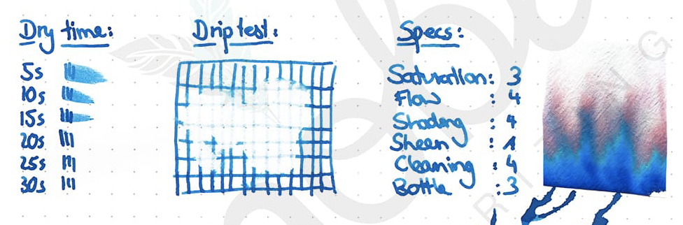
Water resistance
On its right is a water resistance drip test. For this test, water is dripped onto a grid drawn with the ink and dried with kitchen paper after ten seconds. This determines whether the ink is suitable for signatures and important documents.
Ink qualities – Specs
The third block of the third row rates six ink qualities (specs) on a scale of zero to five. The number zero is awarded if the quality is non-existent, and the number five is awarded if the quality is strongest. Ratings are made by comparing the ink with similar inks and are meant to give an impressionistic rating of the ink.
Ink saturation
Saturation refers to the ratio of ink particles to liquid. Inks with a low saturation often appear light and faded while inks with a high saturation look colourful and vibrant. Details on the ink’s colour composition can be seen in the water chromatography, found on the far right of the ink card.
Flow quality
Flow describes the quality of the flow of the ink. Inks that flow well flow smoothly and effortlessly over the paper without resistance. Reduced flow is characterised by a dry and sluggish feeling when writing. The flow quality you prefer is a personal decision that can only be made after trial and error and has no right or wrong.
Cleaning quality
Cleaning quality describes the ease with which the ink can be cleaned from a fountain pen. Difficulties are sometimes encountered with inks that contain shimmer particles or are waterproof.
Ink bottle
Finally, the bottle category evaluates the bottle in which the ink is sold. Design, practicality, shape and label are taken into consideration. Bottles with a high rating have both unique design elements and thoughtful ergonomic features. An excellent bottle, for example, is that of the Pilot Iroshizuku range. In addition to the timeless elegance of the bottle, a notch is made at the bottom of the glass to allow the last drops of ink to be easily absorbed.
Fourth row – Similar ink colours
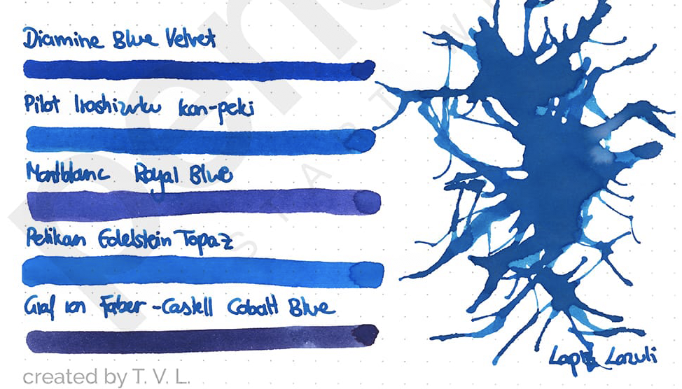
At the bottom left of the Ink Cards, you will find a list of different inks with corresponding samples that are somewhat similar to the ink tested.
To the right, a spider web colour sample has been created with the tested ink to highlight its different core characteristics.
Ink buying made easy
We sincerely hope that our Ink Cards will provide you with the insight necessary to buy the right ink, or simply indulge in the richness of ink colours.
This article was first published in German here.


Schreibe einen Kommentar